Timeline: Dec 2023 - Jul 2024
Role: Project Management, UX Research, UI Design
Impact
• 510,000 increase in Services click throughs with the launch of new Home screen UI and Login All button
• Growth in UX maturity within Product team when value is placed in user research and data-led design decisions
Background
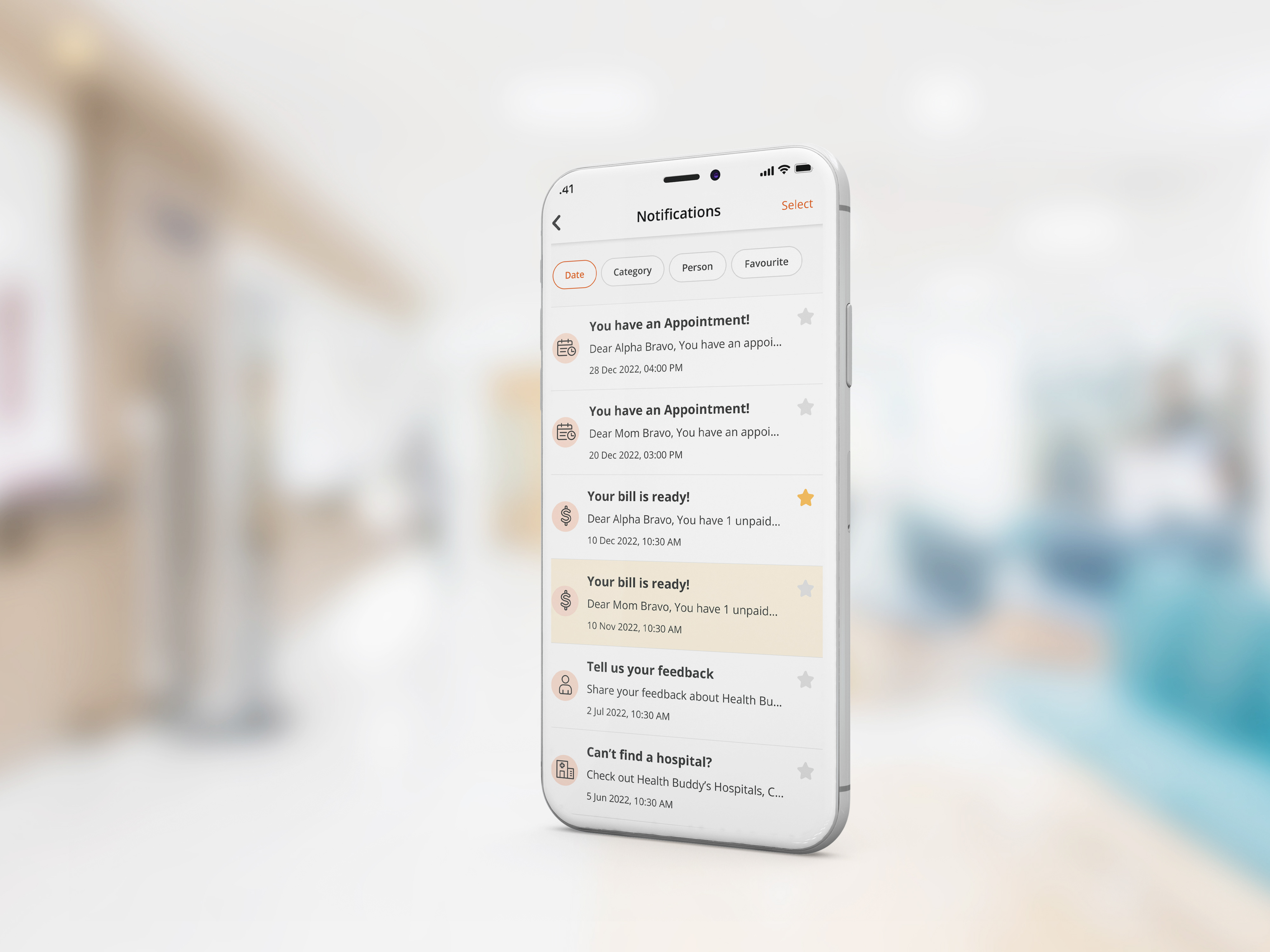
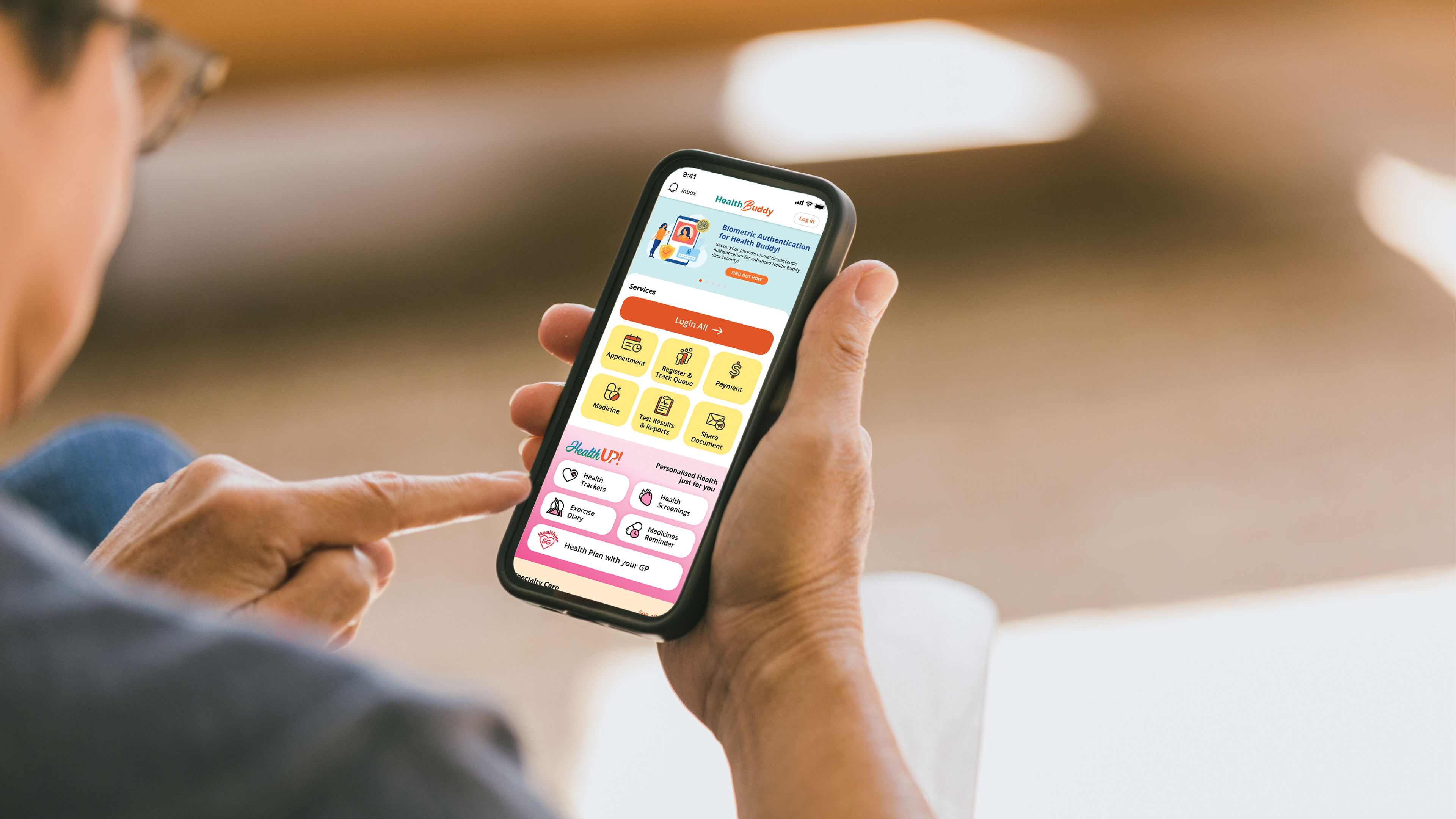
Health Buddy is SingHealth's patient fronting mobile application that seeks to serve patients and their caregivers by providing services such as: Appointments, Payments etc.
Through the years, collaboration with internal stakeholders (Specialties, Institutions) have increased Health Buddy's functionality; turning it to an all-encompassing healthcare application.
How might we improve the Home screen user interface and experience of the application to bridge a better patient experience.
A New Perspective
Being the designer for Health Buddy's previous Home screens, I requested to take on the role to manage this project with an external design vendor to execute the final Home screen. This allowed me to plan and carry out research studies to inform our Home screen redesign that was previously not done before.
_____
Health Buddy over the years
Witnessing 3 rounds of interface redesign over the years, the maturity of myself as a designer and the team had a direct impact on the methodologies used/not used in designing. This project will focus on the interface transition from 2022 to 2024.

_____
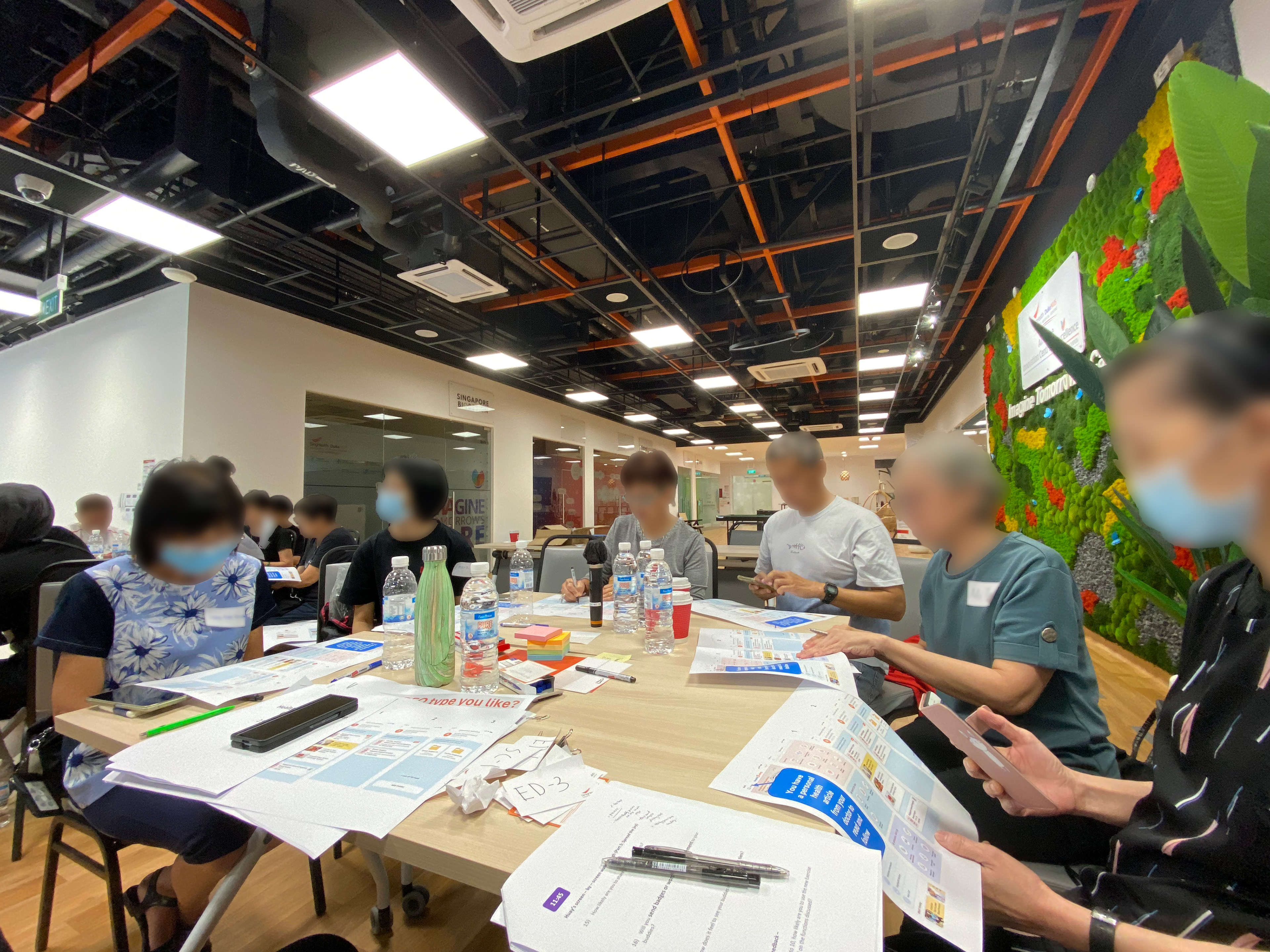
Understanding users through Focus Group
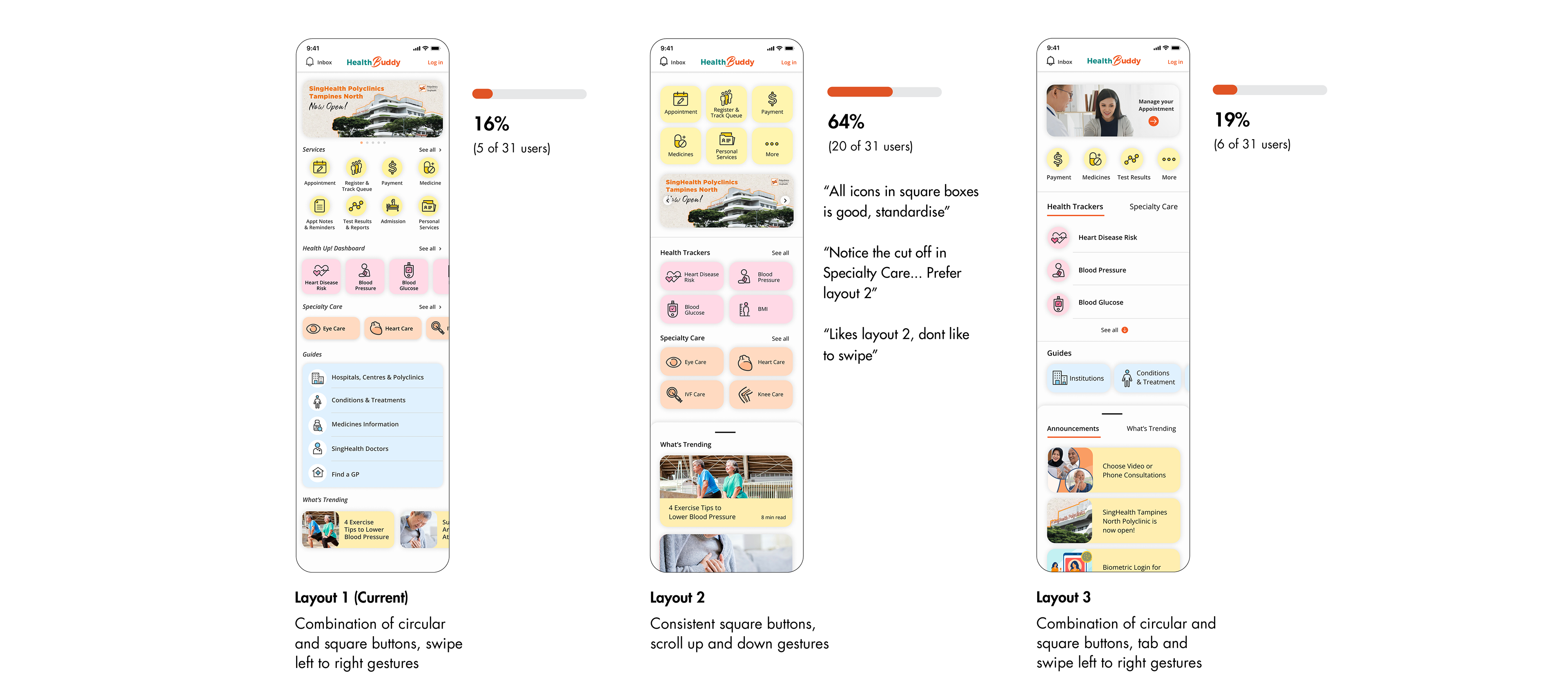
The team recruited 31 Health Buddy users age 50 & above as our senior target audience.
Participants were given prototype links on their phone with mockup variations showcasing current and potential designs on Colour and Layout. In this focus group, the team sought to gather initial insights that would later inform our Home screen design decision.
54% of users chose Colour 2
“Plain clean background, less busyness to impede recognition”
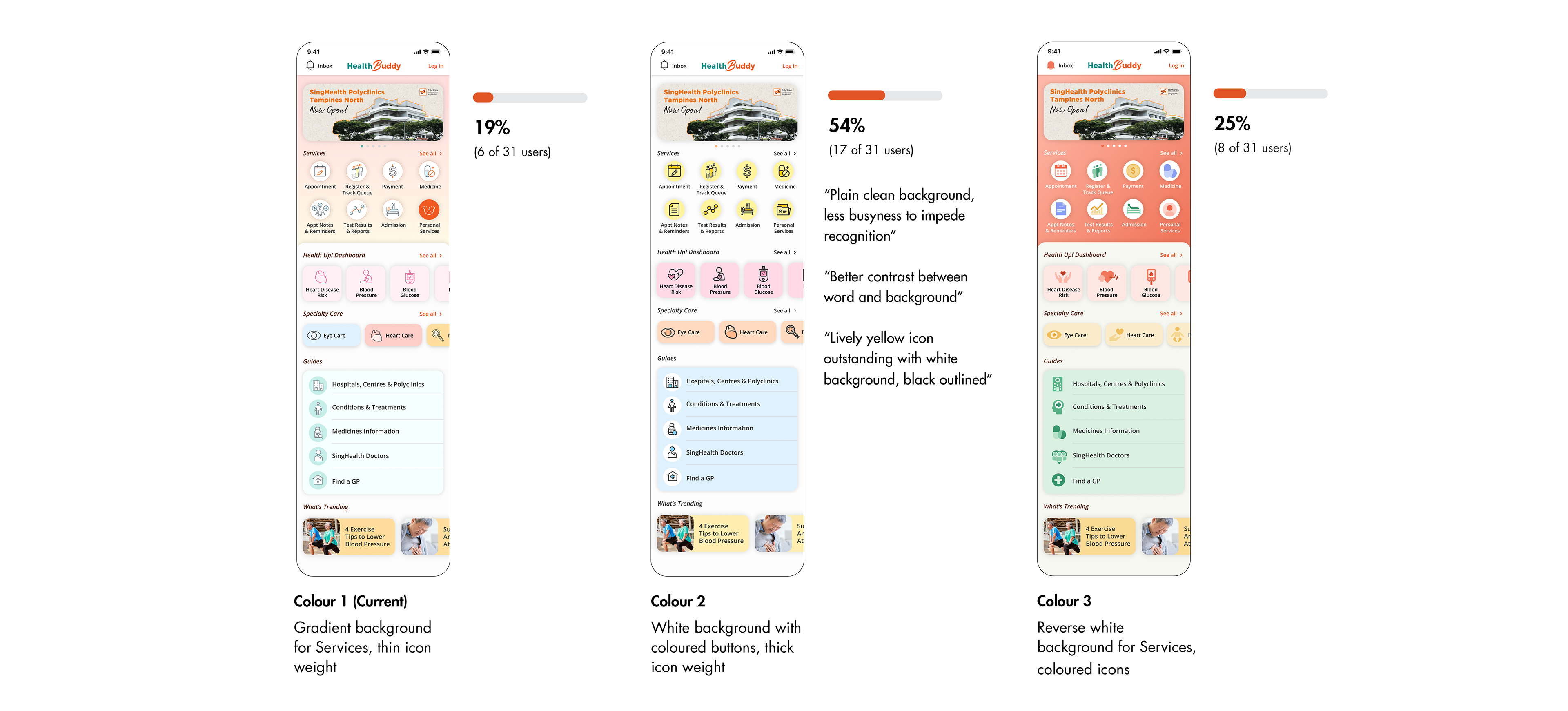
64% of users chose Layout 2
“All icons in square boxes is good, standardise”
Design Imperatives for Home screen
1. Good Contrast
As most of the seniors are low-vision users, it is important to make sure that there is high contrast for text and background used.
2. Consistency in layout and button styles
The preference for consistent button styles (squares) aids overall usability. For core functionality, it is important to show buttons upfront (not hidden) to increase ease of navigation.
_____
Initial Design Iterations
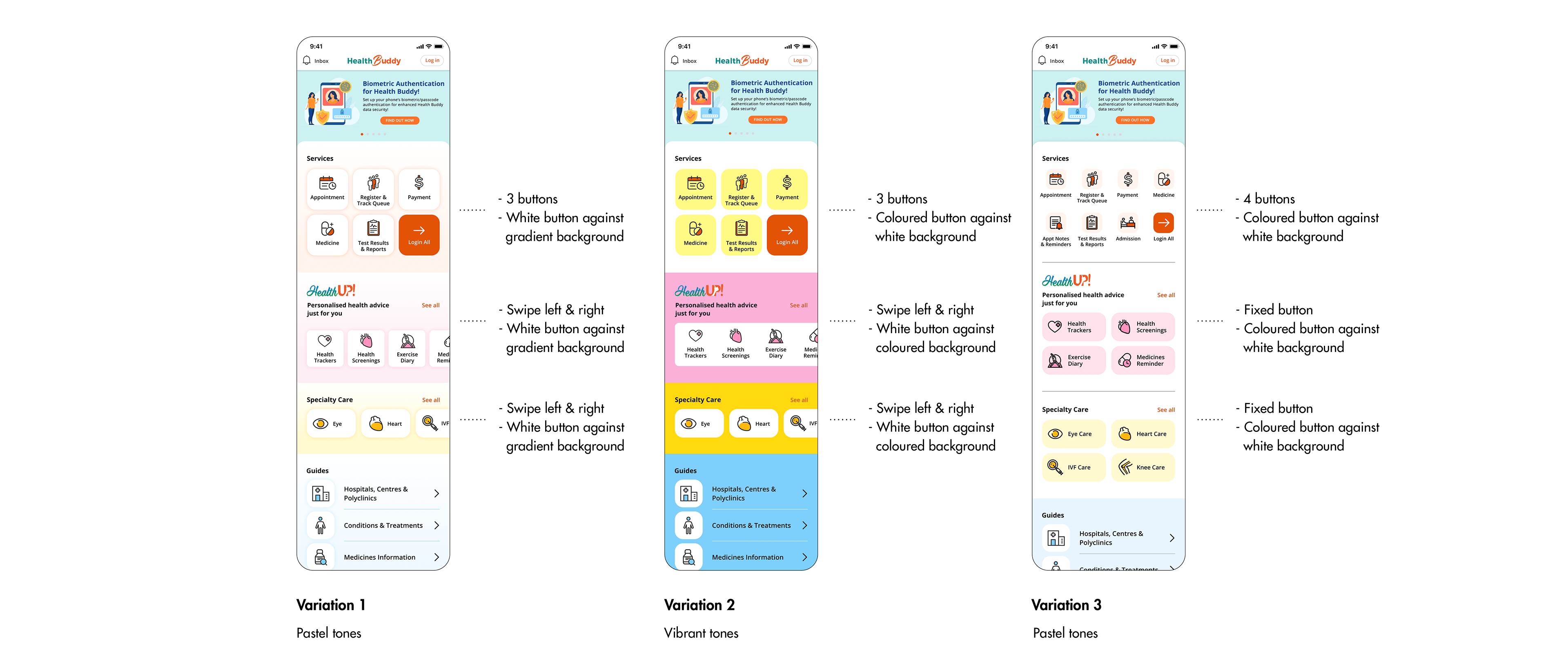
The insights gathered from the focus group were shared with the design vendor that guided their design iterations.
In the design iteration process, the designer expressed a strong preference in using pastel colours to increase visibility of functions. However our team felt that the pastel colours were too subtle while the vibrant variation was too jarring when we tested the mockups on our mobile devices.
To further validate our design directions, I decided to personally refine the variations and prepare for a quantitative A/B test before returning to the designer on the next iteration.
_____
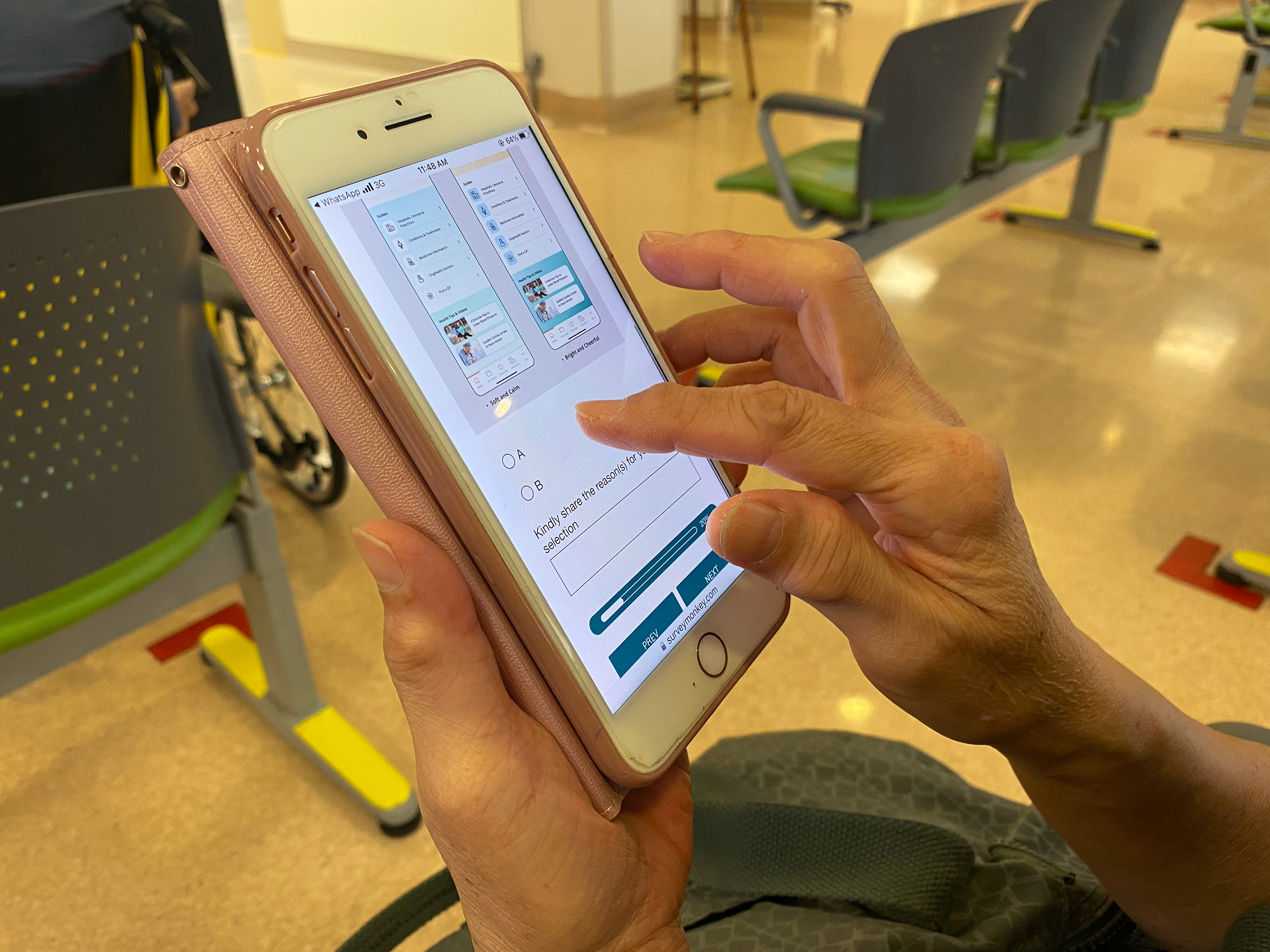
Design Validation through Quantitative A/B Test
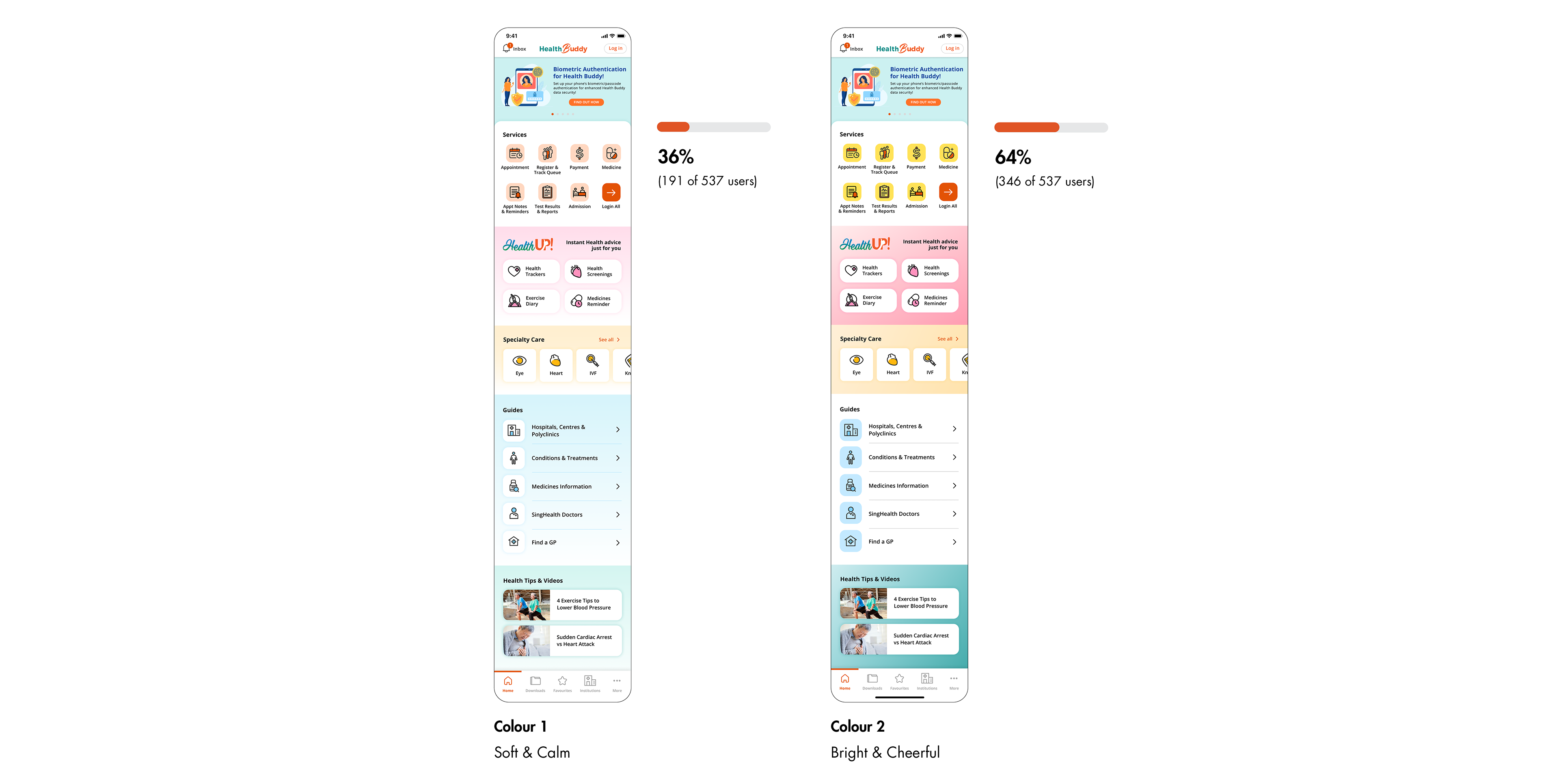
The test gathered 537 respondents age 50 & above
Respondents were given 2 colour style and button layout variation through 'Survey Monkey'. The following were the results and insights gathered that gave the team a decisive and clear design direction.
64% of users chose Bright and Cheerful
1. Cheerful and bright colours livens user's mood when engaging in a Health app
“I prefer bright and cheerful as it brightens my visit and days ahead"
"Brighter colour, cheer up our mood"
2. Good contrast used in buttons/tabs increase visibility of function
“Darker colours make the contrast clearer and better”
"In Health Up, Specialty Care and Health Tips and video, there is good contrast between the items and background"
67% of users prefer 3 Services per row
1. Bigger buttons with larger touch points increases visibility and readability of function
“3 in a row will be more spacious and users who has big fingers will be able to select easily"
"Most Singaporeans are short sighted or older in age hence a large display is preferred"
2. Prioritisation of essential features decreases clutter in layout
“I only need 2 to 4 essential services each time I log in"
"Less cluttered with only more commonly used options upfront"

_____
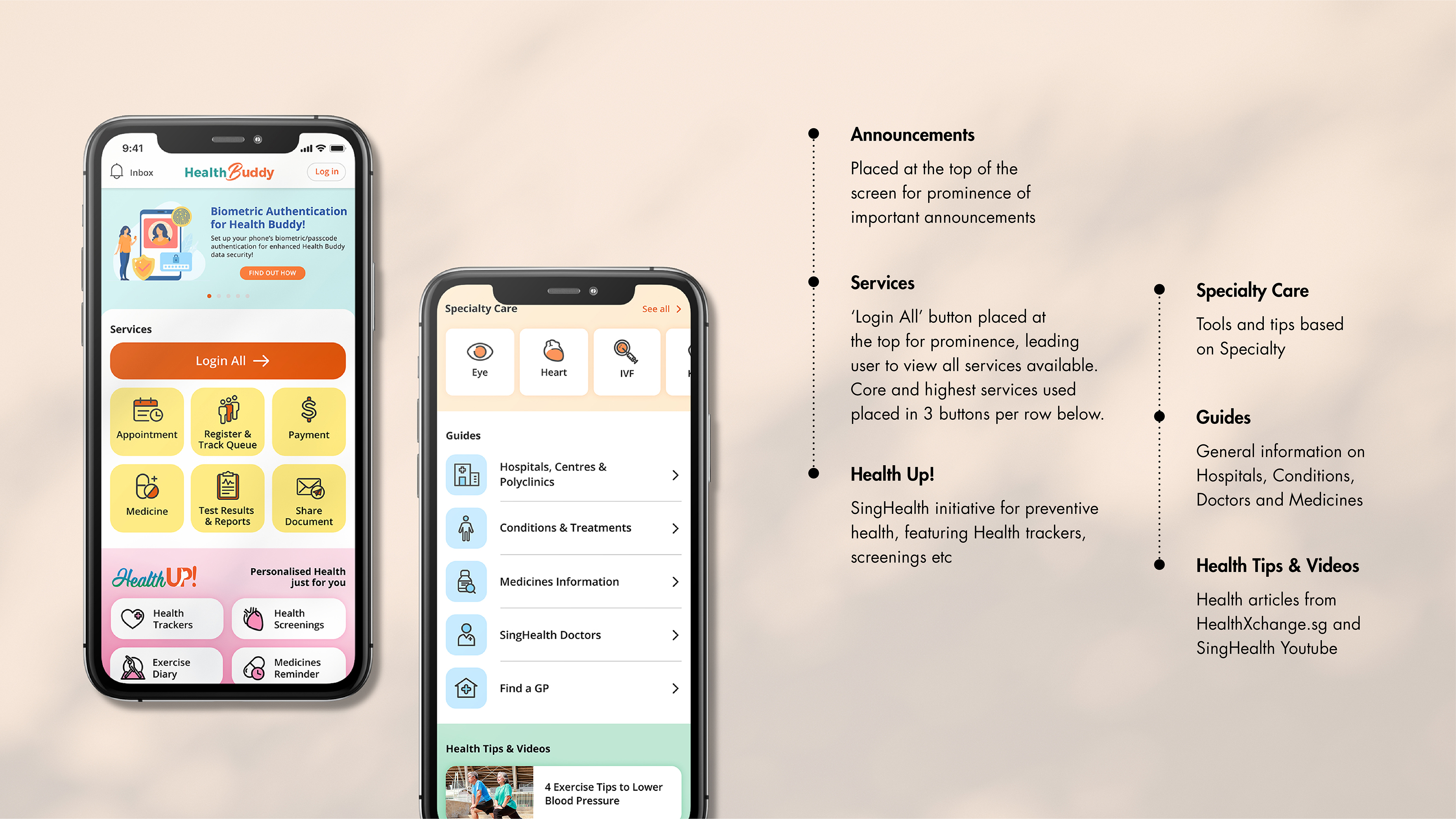
Final Design we launched
With the insights gathered from the quantitative survey, we decided to go with the highest votes for the colour and button layout direction and tweaked the design slightly to meet the business requirements.
Concluding thoughts
One of the biggest challenge I faced in this project is to manage internal stakeholder and external design vendor's communication and relationship while working with a tight timeline. Removing myself from the role of a designer made me realise that there were many ways our team could improve in our design communication.
As this project dealt a lot with design aesthetics and there were many design opinions by different members of the team, I am extremely glad that the research data and insights were able to drive the final Home screen. The discovered insights made me more empathetic with the seniors I am designing for and has laid the foundations for future designs.
_____
Next Steps
Even though the Home screen has changed, there has always been many design discrepancies within the internal screens as more functions onboard. It will be a goal for myself and the team to craft our very own design system to bring consistency in our product and improve the way we work with other designers and developers.